


Blue Sage Phase III, a modern prairie new build in Omaha
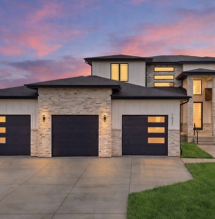
Blue Sage is a modern prairie home west of Omaha, designed inside and out rather than decorated room by room. From the street it is all clean horizontals and a mix of stone and dark cladding, the kind of house that looks confident without shouting about it. Inside, the same discipline holds. There is a quiet, warm base through the main rooms, and then a handful of spaces where the house takes a real swing and gets away with it: a clay-painted dining ceiling, a blush bar with a green stone counter, a gallery wall climbing the stairs. That mix is the whole idea here, calm enough to live in and bold enough to remember. What follows is a walk through it, the easy rooms and the brave ones, with a note at the end on how they were kept from fighting each other.

The prairie style and the setting
Before the rooms, the style sets the terms. A modern prairie home leans on long horizontal lines, deep overhangs and a mix of stone and dark cladding, and Blue Sage follows that language closely on the outside. The interior answers it rather than ignoring it. Ceilings are kept generous, sightlines run long between the main rooms, and the palette stays grounded in the warm, earthy tones the style is built on, which is part of why the clay dining ceiling and the green stone bar feel at home rather than bolted on. The windows are placed to pull in the flat prairie light through the day, so the calm rooms stay bright and the bold ones have something natural to play against. Matching the inside to the architecture sounds obvious and is often skipped, and skipping it is what makes a lot of new builds feel like a nice interior dropped into the wrong shell. Here the two were designed as one.
The great room
The great room is built around a fireplace wall flanked by white built-ins, with a mounted screen set cleanly into the joinery so the technology does not take over the room. Two cream sofas face each other across a round concrete-look table, with a patterned rug holding the group together and tall windows keeping the whole thing bright through the day. It is a restrained room on purpose. After the bolder spaces elsewhere in the house, this is where the design steps back and lets the family live, which is the right call for the room people actually spend their evenings in. The built-ins do the quiet work, giving the fireplace somewhere to sit and the everyday clutter somewhere to hide, so the room stays calm without feeling bare. Getting a main living room to feel both finished and relaxed is harder than it looks, and the restraint here is what pulls it off.


The kitchen
The kitchen keeps the calm but adds the one piece of real drama a kitchen can carry, a marble island with a waterfall edge that anchors the whole room. White cabinetry runs quiet around the perimeter, warmed by a wood open shelf and a ring pendant over the island, and the window line keeps it full of daylight. Seating along the island makes it the gathering point, which is what an open kitchen has to be, the spot for breakfast, homework and a glass of wine while someone cooks. A walk-in pantry takes the working mess out of sight so the room you actually see stays clean. Nothing here is fussy. The marble is allowed to be the feature and everything else is kept simple around it, so the room reads as considered rather than busy, and it will still look right in ten years because the bones are quiet.
The dining nook
The dining nook is where Blue Sage takes its first swing, and it is a good one. The ceiling is painted a warm clay, a colour most people would never think to put overhead, and it turns an ordinary corner into the spot everyone wants to sit. A built-in banquette wraps one side, a round timber table keeps it sociable, and upholstered chairs soften the rest. Big windows and a sliding door to the deck mean the whole nook fills with light and opens straight to the outside in summer. A painted ceiling is the sort of detail that costs very little and changes everything, as long as it is done with nerve and matched to the right colour. Here it is both, and because the walls and furniture around it are kept calm, the ceiling gets to be the whole story rather than one loud thing among many.


The staircase light
The stairwell is treated as a chance for a moment rather than a dead space to pass through. A long sculptural light fixture drops through the double height, turning the stair into something you notice rather than something you simply use. Against the plain wall it reads almost like a piece of art, and because the stair runs through the centre of the house it sets a tone the moment you arrive. It is a small spend for a large effect, which is exactly the kind of decision that separates a designed house from a built one, and it is far cheaper to plan in from the start than to add once the drywall is closed up.
The stair gallery and hallway
Climbing the stairs you meet a gallery wall of framed black and white photographs, hung properly in a considered grid rather than scattered, against a board-and-batten wall that gives the hallway texture. A black horizontal railing keeps the line modern, and soft carpet quiets the upstairs. Hallways are usually the forgotten part of a house, left blank and purely functional, a corridor to get through. Here the stair and the landing are treated as rooms in their own right, so the journey between floors is part of the design rather than a gap in it. It is the kind of attention most people never consciously notice and always feel, and it is what makes a whole house read as finished rather than furnished in the main rooms and forgotten everywhere else.


The primary suite
The primary suite is calm and hotel-like, with the bathroom and bedroom designed as one connected space rather than two rooms with a door between them. A large glass shower keeps the tilework reading as a single clean surface, and the view runs straight through to the bedroom beyond, with its round mirror and upholstered bed. Keeping the sightline open between the two makes the suite feel larger and more considered, like somewhere that was planned as a retreat rather than assembled from standard parts. It is restful by design, the room the rest of the house quiets down toward, and the kind of space that pays for the planning every single morning rather than only in photographs.
The guest bathroom
The guest bathroom shows the same care as the private ones, which is where a lot of projects quietly cut the corner. A sage green vanity gives the room a colour of its own, grounded by a dark linear tile backsplash, a white stone top and black fixtures. It is a small room given a clear identity rather than left as a plain white box, so a guest feels looked after rather than tolerated. Bathrooms like this are cheap to make dull and only a little more to make good, and the difference is exactly what a visitor remembers and mentions about a house. The green is confident without being loud, which is the right pitch for a room shared by the whole household and everyone who visits.


The bar
The bar is the house at its most playful. Blush cabinetry, a green stone counter, a black vessel sink and a brass faucet, finished with a scalloped gold mirror, a combination that has no business working and completely does. It is tucked where a bar should be, a little jewel box of a space you come upon rather than live in, which is exactly where you can afford to be this brave. The restraint everywhere else in the house is what earns this room the right to go all in. On its own, spread across a whole house, it would be too much. As the one loud note against a calm backdrop, it is the room guests photograph and talk about, and it works because it was planned as the exception, not the rule.
The powder room
The powder room keeps things tailored and a touch moody, which is the right register for the one room guests use with the door shut. A charcoal vanity sits below a simple oval mirror, with a white stone top and warm metal fixtures to lift it. It is quieter than the bar next door on purpose, because a house cannot be loud in every room or nothing stands out and the whole thing turns to noise. This one is calm and well made, the kind of small space that looks effortless and is anything but, and it gives the eye somewhere to rest between the braver rooms.


The mudroom
The mudroom is the room that decides whether a house actually works on a wet Tuesday, and it was designed properly rather than tacked on at the end. Greige built-ins give everyone a locker, a bench offers a place to land, and hooks and cubbies keep the daily pile of bags and coats contained before it spreads into the rest of the house. The back panel carries a warm floral paper, a small flourish that turns a pure utility space into somewhere pleasant to pass through. It is a quiet sign that the whole house was thought through, because the rooms that never make the listing photos were given the same care as the ones that do, and those are the rooms a family actually lives in.
How the house came together
Blue Sage works because the calm and the bold were planned together from the start, not bolted on afterwards. The shell, the palette and the lighting were kept disciplined, and that discipline is what bought the freedom to paint a ceiling clay and build a blush bar without the house falling apart. That balance is far easier to hold when one person is carrying the whole plan, deciding where to be quiet and where to take a risk, and making sure the brave rooms stay the exception rather than the rule. It is slower to plan that way, and it is the reason the finished home reads as one confident house rather than a row of good ideas that never met each other. The quiet rooms are what make the loud ones land, and knowing which should be which is most of the job.
Frequently asked questions

READY TO BEGIN?
Blue Sage is what happens when a calm, well-built house is given room for a few brave moments, all handled together from the plans through to the furniture. If you are building or furnishing a home around Omaha and want that same balance, it starts with a conversation. Call (402) 235-8276 or use the contact page, and we will talk through what your project involves and where to begin.